Pocket Mode
Annotate from a phone or tablet. Touch devices are routed automatically to a swipeable card stack with thumb-zone controls, offline annotation with sync, and home-screen install as a PWA.
New in v2.7.0
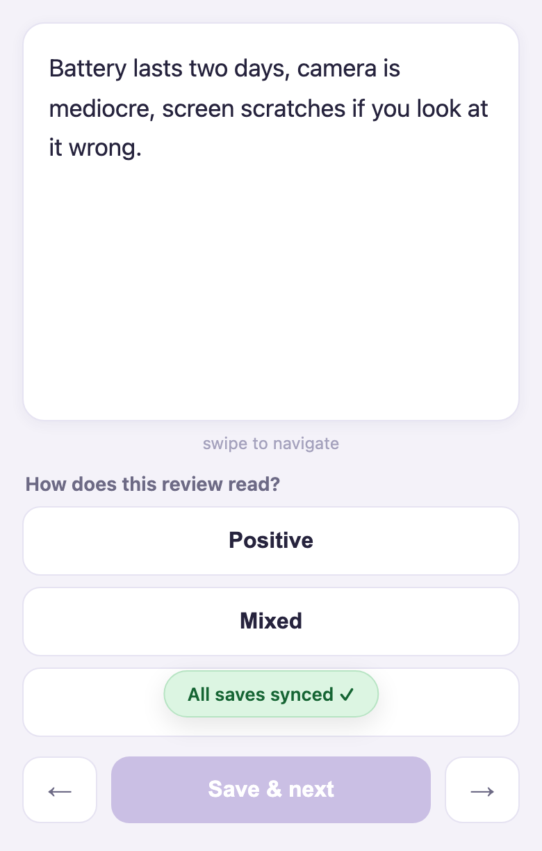
Potato supports annotating from phones and tablets. Enable Pocket Mode and touch devices that open your task are automatically routed to a mobile interface: a card stack with thumb-zone label buttons, swipe navigation, offline annotation with automatic sync, and home-screen installation as a PWA. Desktop users see the normal interface and nothing changes for them.
Not every annotation type belongs on a phone. Span highlighting and bounding boxes are desktop tasks. Potato is explicit about this: touch-capable tasks get the mobile interface, tasks that are not get a clear warning instead of a degraded UI, and the admin dashboard shows who is annotating from which kind of device either way.
Configuration
pocket:
  enabled: true        # master switch for the mobile interface (default: false)
  auto_redirect: true  # send phones/tablets to /pocket automatically (default: true)
  batch_size: 25       # items fetched per batch; also the offline queue depth (1-200)
Which annotation types are mobile friendly
| Touch-capable (served on mobile) | Desktop-only |
|---|---|
radio, multiselect, likert, slider, number, text/textbox, pure_display | span, image and bounding-box, video, audio, multirate, and everything else |
A task is touch-capable only if all of its schemes are in the left column. A task mixing in even one desktop-only scheme is not degraded onto touch: phones are not redirected, and they see a dismissible notice that the task is not optimized for mobile.
If you expect mobile annotators, design for it. A single-radio task is the ideal case, where one tap equals one labeled item.
How device routing works
| Device | Task touch-capable, pocket enabled | Task not touch-capable |
|---|---|---|
| Desktop | normal interface | normal interface |
| Phone / tablet | redirected to the mobile interface | normal interface + a dismissible warning |
Detection happens in two layers.
- Server-side (User-Agent). Phones and most tablets identify themselves, and are redirected before the desktop page ever renders. API clients and unrecognized agents count as desktop, so scripts and integrations are never redirected.
- Client-side (pointer check). Some tablets masquerade as desktops. iPadOS Safari, for one, reports itself as a Mac. A script on the annotation page checks whether the device's primary pointer is coarse (a finger) and redirects those too. Touchscreen laptops are unaffected, because their primary pointer is the trackpad.
Routing applies only to annotators in the annotation phase. Consent, instruction, and survey pages are untouched.
Desktop users can opt in: on pocket-capable tasks the navbar shows a Compact view link to /pocket, where the card stack becomes a rapid one-click-per-item labeling view. Mobile users can opt out with the Desktop site link, and the choice sticks for the session.
The mobile interface
- Card stack — one item per card. Swipe left for next, swipe right for previous, with arrow buttons for non-touch use. A haptic tick confirms each save on devices that support it.
- Thumb-zone controls — label buttons sit in the bottom third of the screen where a thumb actually reaches. Touch targets are 48px or larger, safe-area insets are respected on notched phones, and
prefers-reduced-motionis honored. - Scheme rendering — single radio and likert tasks auto-advance on tap. Multi-scheme cards show every control plus an explicit Save & next.
- Offline annotation — the current batch is prefetched and mirrored to localStorage. If the connection drops, annotating continues, a chip shows "Offline — N saves queued," and the queue flushes automatically on reconnect. A service worker caches the app shell after the first visit, so the page loads with no connection. Prefetch a batch on wifi and annotate anywhere, then sync once the device is back in coverage.
- Install as an app — the page ships a web manifest, so "Add to Home Screen" gives a standalone app with its own icon.
Saves use the same /updateinstance endpoint and payload as the desktop page. Pocket Mode adds no new write path, so exports, agreement statistics, the admin dashboard, and quality control all see ordinary annotations.
The Devices tab
The admin dashboard gains a Devices tab showing, per annotator: last device seen, visit counts by device class, how many times they used the mobile interface, and when they were last seen. A summary line gives the headline ("3 of 12 users have visited from a phone or tablet").
This matters in two directions. If your task is not touch-capable and the Devices tab shows annotators on phones anyway, those annotators saw the warning and kept going, so their output is worth a look. And because visits are tracked whether or not Pocket Mode is enabled, the tab answers "would enabling Pocket Mode help?" before you turn it on.
Data lives in <output_annotation_dir>/pocket/device_visits.json as per-user aggregates only. There is no per-item tracking.
Troubleshooting
- A phone is not being redirected. Check that
pocket.enabledandpocket.auto_redirectare true, that the task is touch-capable (GET /pocket/api/routingshowscapable: true), and that the user has not chosen "Desktop site" this session. - An iPad gets the desktop page on first load. iPadOS Safari identifies itself as a Mac, so the server cannot catch it. The client-side pointer check redirects it once the page's scripts run.
- A user is "done" on mobile but the desktop page shows remaining items. They may have unsynced offline saves. The sync chip shows the queue, which flushes when the device is back online.
Further reading
- Task assignment — mobile users draw from the same queue as everyone else
- Admin dashboard — where the Devices tab lives
- Crowdsourcing on Prolific and MTurk
- Source documentation